Loading cart contents...
Map Projections: The Complete Guide to Mercator, Azimuthal, Robinson, Gall-Peters and Every Major World Map Projection
Introduction
The Earth is a sphere. A map is flat. That single contradiction is the root of every debate cartographers have argued about for the last five hundred years, and it’s the reason there are literally hundreds of different map projections in existence today.
Whenever a curved surface is flattened onto paper or a screen, something has to give. A projection can preserve shape, but not size. It can preserve distance, but not direction. No projection has ever managed to preserve everything at once — and mathematically, none ever will.
Every world map you have ever looked at — in a classroom, an airport lounge, a ship’s chart room, or hanging on your office wall — is a compromise between five things:
- Size (area)
- Shape (the outline of continents)
- Distance (how far one point is from another)
- Angles (directional accuracy)
- Direction (bearing, used in navigation)
This guide walks through the most important geographic projections used in cartography, explains the trade-offs behind each one, and helps you decide which projection makes the most sense for a classroom, an office, a nursery, or a serious navigation reference — including which one deserves a spot as your next wall map.
What Are Map Projections?
A map projection is a mathematical method for transferring the coordinates of a round planet onto a flat surface. Imagine shining a light through a transparent globe onto a sheet of paper, a cylinder wrapped around it, or a cone placed on top — the shadows cast by the continents become the projection.
The Geometric Principle
Most classical projections fall into three geometric families:
- Cylindrical — the globe is projected onto a cylinder wrapped around the equator (Mercator is the most famous example)
- Conic — the globe is projected onto a cone, ideal for mid-latitude regions (Lambert Conformal Conic)
- Azimuthal (planar) — the globe is projected onto a flat plane, usually touching at one point like a pole
A Brief Historical Evolution
Cartographic projection isn’t a modern invention. Ancient Greek scholars like Ptolemy were already grappling with how to represent a spherical Earth on flat papyrus. The real turning point came in the Age of Exploration, when Gerardus Mercator’s 1569 map gave sailors a tool that finally made compass navigation mathematically reliable.
From there, the number of projections exploded — because every new use case (aviation, weather forecasting, satellite imagery, political maps, school atlases) demanded a different trade-off between shape, area, and distance. That’s why there isn’t one “correct” projection — there are dozens of purpose-built ones.
(Internal link suggestion: “The History of Cartography”)
The Most Important Map Projections
Mercator Projection
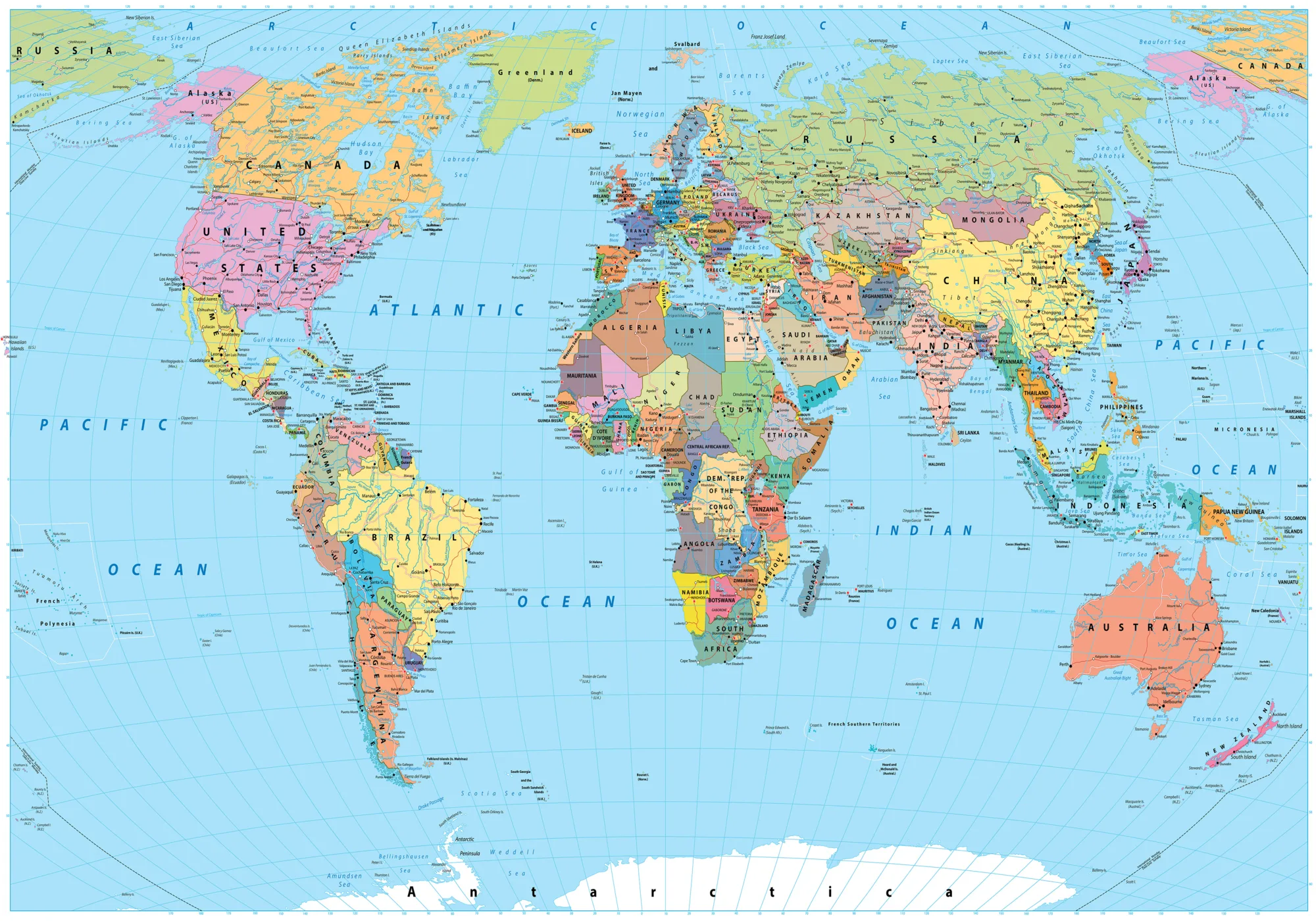
The Mercator projection, created by Flemish cartographer Gerardus Mercator in 1569, is probably the single most recognizable world map in history.
How it works: Mercator projects the globe onto a cylinder tangent to the equator, then “unrolls” it into a flat rectangle. To keep compass bearings as straight lines — essential for sailors — the projection must stretch landmasses more and more as they move away from the equator.
Advantages:
- Preserves angles and shapes locally (it’s a conformal projection)
- A straight line on the map corresponds to a constant compass bearing (a rhumb line), which made it indispensable for maritime navigation for over 400 years
- Still the default projection for most digital web maps
Disadvantages:
- Massively distorts area near the poles
- This is why Greenland — roughly 1/14th the size of Africa in real life — appears comparable to it in size on a standard Mercator map
- Not suitable for teaching students accurate relative country sizes
When to buy a Mercator wall map: if you want a classic, recognizable, decorative look for an office or study, or if the map will be used alongside navigation or maritime history content. Not the best pick for a geography classroom focused on accurate proportions.
Robinson Projection
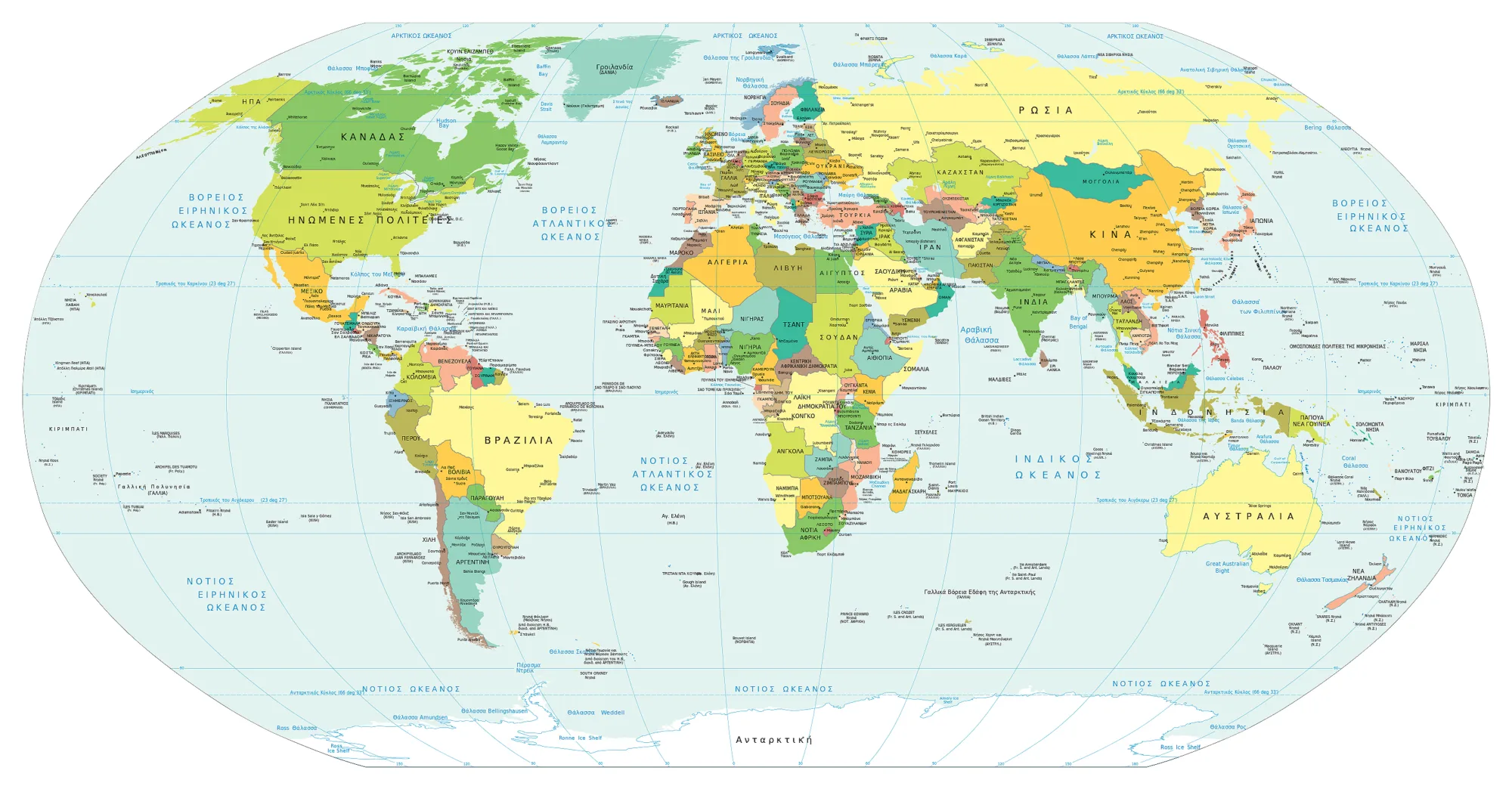
Created by Arthur H. Robinson in 1963 for Rand McNally, the Robinson projection was designed specifically to “look right” rather than to preserve any single property perfectly.
Characteristics: It’s a compromise projection — it doesn’t perfectly preserve area, shape, distance, or direction, but keeps distortion in each category relatively low across the whole map.
Balance of distortions: Landmasses look far more natural and proportionate than on a Mercator map, without the visual stretching near the poles.
Use in education: The Robinson projection was used by National Geographic for world maps between 1988 and 1998, and it remains a favorite in classrooms because it offers an intuitive, visually pleasing balance that doesn’t mislead students about relative continent sizes as severely as Mercator does.
Winkel Tripel
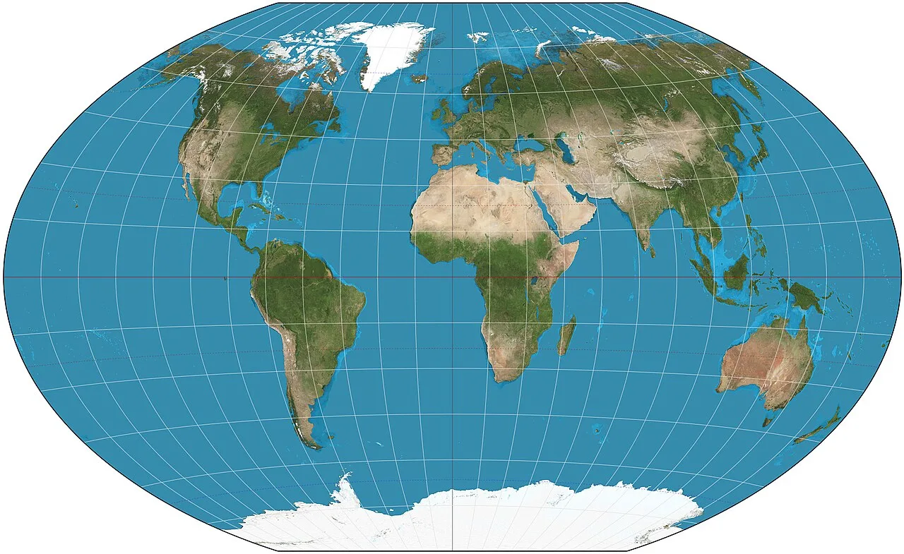
Creator: German cartographer Oswald Winkel developed this projection in 1921, combining elements of three earlier methods (hence “tripel,” German for “triple”).
Why National Geographic uses it: In 1998, National Geographic officially adopted the Winkel Tripel as its standard reference map, and it remains the standard today because it minimizes the combined distortion of area, direction, and distance better than almost any other compromise projection.
Balanced distortion: Rather than being perfect at any one property, it spreads the “cost” of flattening the globe evenly, which is exactly why it has become the gold standard for general reference and educational wall maps.
Gall-Peters Projection
History: James Gall first described this equal-area projection in 1855; it was independently popularized by Arno Peters in 1973, which is why it typically carries both names.
Equal-area property: The Gall-Peters projection accurately preserves the relative size of every landmass — a country’s footprint on the map is proportional to its real-world area.
Political and social discussion: Because standard Mercator maps visually inflate wealthy northern nations while shrinking equatorial and southern countries, the Gall-Peters projection became a symbol in debates about geographic bias and Eurocentrism in mapmaking, sparking discussion in classrooms, media, and even television (it famously appears in an episode of The West Wing).
Advantages: Accurate area representation; useful for teaching global population and resource distribution honestly.
Disadvantages: Shapes are noticeably stretched and distorted, especially near the equator and poles, making continents look unfamiliar compared to the maps most people grew up with.
Callout box: Equal-area vs. conformal is the single biggest trade-off in cartography — you can protect a country’s true size, or its true shape, but rarely both at once.
Azimuthal Projections
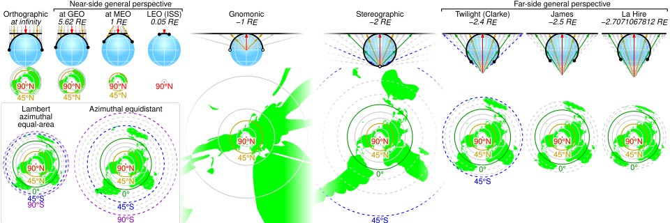
Azimuthal projections map the globe onto a flat plane touching the Earth at a single point — usually a pole, though any point can be chosen as the center.
- Azimuthal Equidistant — preserves accurate distances and directions from the central point to anywhere else on the map. This is the projection used in the United Nations emblem, and it’s ideal for measuring flight distances from a single hub city.
- Polar Projection — a specific azimuthal case centered on the North or South Pole, common in Arctic/Antarctic research and polar flight-path illustrations.
- Gnomonic — the only projection where every great-circle route (the shortest path between two points on a sphere) appears as a perfectly straight line, which makes it valuable for pilots and navigators plotting the shortest route between distant airports.
- Stereographic — preserves angles and shapes locally (conformal), historically used in navigation and now common in crystallography and some meteorological charts.
- Orthographic — mimics the view of Earth as seen from space, showing the planet as it would look from a satellite or the Moon; used mostly for illustrative and educational globes rather than practical navigation.
Lambert Conformal Conic
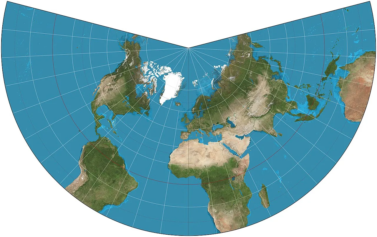
The Lambert Conformal Conic projection wraps a cone around the globe, tangent along one or two chosen lines of latitude.
Aeronautical navigation: Because it preserves angles and keeps straight lines close to great-circle routes across mid-latitudes, it’s the standard projection for aeronautical charts across the United States and Europe.
Meteorology: Its accurate representation of shape and distance at mid-latitudes makes it the go-to projection for weather forecasting maps, especially across North America and Europe.
Mollweide Projection
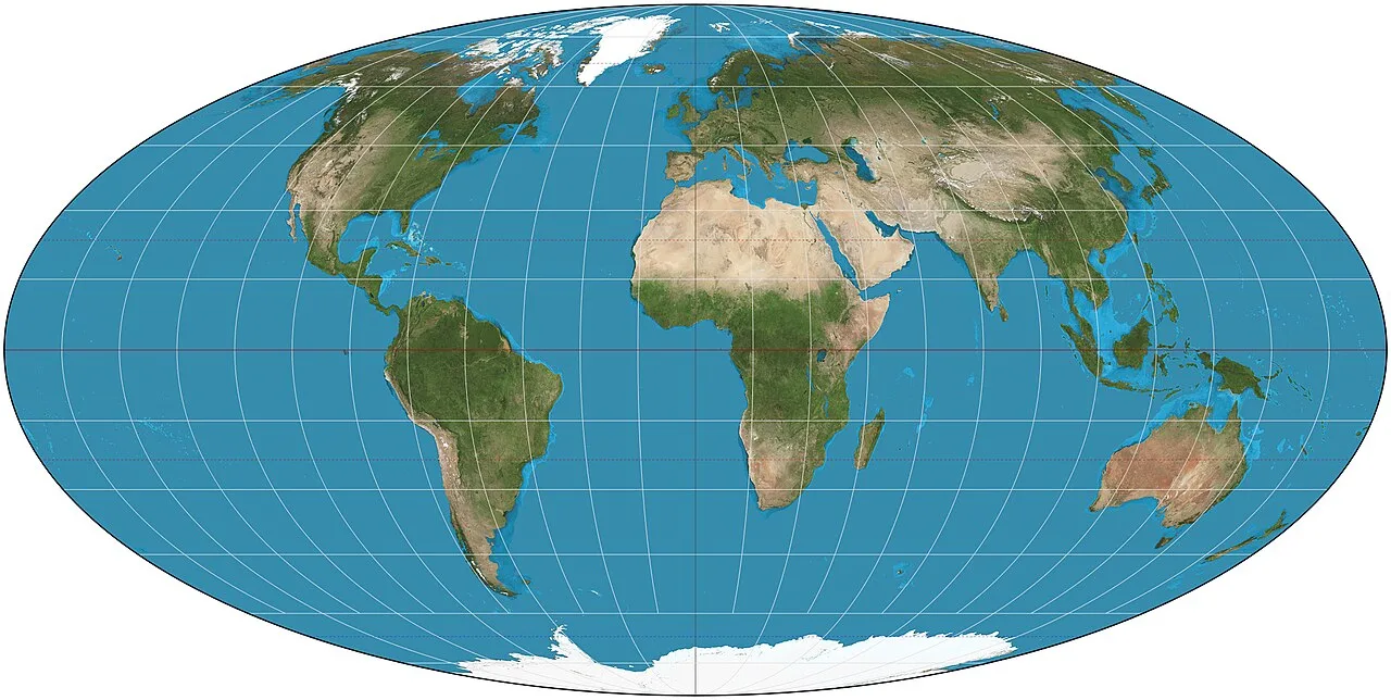
An equal-area projection shaped like an ellipse, first published by Karl Mollweide in 1805.
Thematic maps: Because it preserves area accurately, it’s widely used for thematic maps — climate zones, biomes, and other data that needs true proportional representation.
Population distribution maps: Demographers and statisticians frequently choose Mollweide for world population density maps, since misrepresenting area would distort the data itself.
Sinusoidal Projection
Properties: Also an equal-area projection, the sinusoidal preserves area perfectly but stretches shapes significantly near the outer edges of the map, far from the central meridian.
Historical use: One of the oldest projections still in occasional use today, it dates back to the 16th century and was historically popular for atlases covering equatorial regions like Africa and South America, where distortion is minimal near the map’s center.
Goode Homolosine
The interrupted projection: Created by John Paul Goode in 1923, this projection literally cuts the map into sections — usually along ocean areas — like slicing an orange peel and laying it flat, which drastically reduces shape distortion for continents.
Why it’s used in science: By interrupting the oceans instead of the continents, Goode Homolosine keeps landmass shapes and areas both close to accurate, making it a favorite for scientific and educational world maps that need to show continents with minimal distortion.
Equirectangular Projection
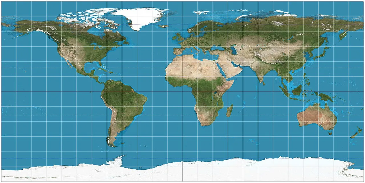
GIS applications: Also called the “Plate Carrée,” this is the simplest of all projections — it maps latitude and longitude directly onto a grid of equally spaced horizontal and vertical lines.
Video games and simulations: Because of its simplicity, it’s a common default for texture-mapping globes in video games, flight simulators, and 3D graphics engines.
Satellite applications: Many satellite imagery datasets and raw GIS data files use equirectangular as their base grid, since it’s computationally simple to convert to and from spherical coordinates.
Comparison of All Major Projections
| Projection | Preserves Shape | Preserves Area | Preserves Distance | Best Suited For | Ideal as a Wall Map |
|---|---|---|---|---|---|
| Mercator | Yes (locally) | No | No | Maritime navigation, decorative/office use | Yes, for decor & maritime themes |
| Robinson | Approximate | Approximate | Approximate | Classrooms, general reference | Yes, excellent all-rounder |
| Winkel Tripel | Approximate | Approximate | Approximate | Education, general reference | Yes, top recommendation |
| Gall-Peters | No | Yes | No | Teaching accurate area, social studies | Situational, for data-driven use |
| Azimuthal Equidistant | No | No | Yes (from center) | Flight distance planning, UN-style maps | Situational, specialty decor |
| Lambert Conformal Conic | Yes (locally) | No | Approximate | Aviation charts, weather maps | Rarely used decoratively |
| Mollweide | No | Yes | No | Thematic & population maps | Situational, data visualization |
| Sinusoidal | No | Yes | No | Equatorial region atlases | Rarely used decoratively |
| Goode Homolosine | Approximate | Yes | No | Scientific & educational maps | Yes, for science-themed spaces |
| Equirectangular | No | No | No | GIS, games, satellite data | Not recommended for display |
(Suggested visual: a side-by-side comparison graphic showing the same region — for example, Greenland and Africa — rendered in Mercator, Robinson, Gall-Peters, and Winkel Tripel, to make the distortion concept immediately visible.)
Distortions in Maps: What Actually Gets Sacrificed
Every projection sacrifices at least one of these four properties:
- Area distortion — landmasses appear larger or smaller than their true proportional size (the classic Mercator/Greenland problem)
- Angle distortion — the angles between features are stretched or compressed, which matters enormously for navigation
- Distance distortion — the scale of the map changes depending on location, so a ruler measurement means something different in different parts of the same map
- Direction distortion — the bearing from one point to another no longer matches true compass direction
Understanding which of these four your map sacrifices is the single most useful piece of cartographic literacy you can have — whether you’re choosing a decorative piece or a navigational tool.
Which Projection Is “Best”?
There is no universally “best” map projection — only the one best suited to your purpose. A few concrete examples:
- Education: Robinson or Winkel Tripel — balanced distortion, intuitive to read, doesn’t mislead students about relative country size
- Decoration: Mercator (classic, familiar look) or Winkel Tripel (modern reference-map aesthetic)
- Navigation (maritime): Mercator — still the gold standard for constant-bearing straight-line plotting
- Travel: Azimuthal Equidistant, especially centered on your home city, to visualize flight distances
- Schools: Winkel Tripel or Robinson, for balanced, non-misleading world maps
- Office spaces: Mercator or Robinson for a professional, timeless look
- Scientific use: Goode Homolosine or Mollweide, when area accuracy actually matters for the data being shown
(Internal link suggestion: “Political Map or Physical Map? How to Choose”)
How to Choose a Wall Map
Picking the right wall map comes down to matching the projection — and the style — to the room and the purpose.
- For a child’s bedroom: choose a colorful, simplified Robinson or Winkel Tripel map — visually engaging without the exaggerated polar stretching of Mercator, which can create confusing first impressions of world geography.
- For a school classroom: Winkel Tripel or Robinson are the standard choice, since they minimize the risk of teaching distorted proportions.
- For an office: a Mercator-style antique or vintage-look map often works best aesthetically, especially in a classic or nautical-themed interior.
- For frequent travelers: an Azimuthal Equidistant map centered on your home airport turns the map into a genuinely useful travel-planning tool, not just decoration.
- For businesses with a global footprint: a Winkel Tripel or Robinson map communicates a balanced, professional worldview without political undertones.
- For universities and research settings: Goode Homolosine or Mollweide maps signal scientific accuracy and are often preferred in geography, environmental science, and demography departments.
Callout box: When in doubt, a Winkel Tripel or Robinson wall map is the safest, most broadly appropriate choice for almost any room — it balances familiarity with accuracy.
(Internal link suggestion: “How to Choose the Right Wall Map for Your Space”)
Common Misconceptions
Is the Mercator map “wrong”? Not wrong — just built for a specific job (navigation) that it still does well. It becomes misleading only when used as a general-purpose reference map without acknowledging its area distortion.
Which map is the “most correct”? None. Every flat map trades one accurate property for another; “most correct” always depends on which property matters most for your purpose.
Is there a map with no distortion at all? No — this is mathematically impossible. A sphere cannot be flattened without stretching, tearing, or compressing somewhere (a principle formalized by Gauss’s Theorema Egregium).
Why do the poles look larger than they really are? On cylindrical projections like Mercator, the meridians (lines of longitude) are drawn parallel instead of converging at the poles as they do on the real globe, which forces horizontal stretching that increases dramatically the closer you get to the poles.
Interesting Facts About Maps and Navigation
- National Geographic switched its official reference map to the Winkel Tripel projection in 1998, after decades of using Robinson and, earlier, Van der Grinten.
- Google Maps uses a variant of the Mercator projection (Web Mercator) for its street-level tile system, primarily because it preserves local shapes well at any zoom level, which is ideal for navigation apps.
- GPS itself doesn’t rely on any 2D projection at all — it calculates 3D positions using satellite triangulation, and the projection only comes into play when that data is displayed on a flat screen.
- Commercial airline route maps you see in in-flight magazines often use an Azimuthal Equidistant projection centered on the airline’s home hub, since it shows true distances from that single point.
- NASA primarily uses orthographic and other true-perspective projections for imagery meant to replicate what an astronaut would actually see from space or the Moon.
- The earliest known globe still in existence, the Erdapfel, was built in 1492 — the same year Columbus set sail — by German cartographer Martin Behaim.
- The Age of Exploration created enormous commercial demand for accurate navigational charts, which is precisely why Mercator’s 1569 map became an instant maritime standard.
- Some aeronautical charts still combine Lambert Conformal Conic for regional detail with gnomonic overlays to help pilots visualize great-circle shortest-path routes.
- Modern satellite imagery platforms often default to equirectangular grids because the math for converting pixel coordinates to latitude/longitude is far simpler than with curved projections.
- Cartographers have documented hundreds of distinct projections since the 16th century, and new ones are still occasionally proposed, usually aiming for a better compromise between area, shape, and distance.
Frequently Asked Questions
1. What is a map projection? A mathematical method for representing the curved surface of the Earth on a flat plane, such as paper or a screen.
2. Why can’t a map be perfectly accurate? Because a sphere cannot be flattened without distorting area, shape, distance, or direction somewhere on the map.
3. What’s the most commonly used projection today? Web Mercator dominates digital maps and navigation apps, while Winkel Tripel is the standard for printed reference and educational maps.
4. Why does Greenland look so big on some maps? Because cylindrical projections like Mercator stretch areas near the poles to keep compass bearings straight, inflating high-latitude landmasses.
5. Is the Gall-Peters projection more “fair” than Mercator? It’s more accurate in terms of relative area, which is why it’s often used to illustrate the true size of equatorial and southern countries, though it distorts shape more heavily.
6. Which projection should a school use? Robinson or Winkel Tripel are generally recommended for balanced, non-misleading classroom instruction.
7. What projection do pilots use? Lambert Conformal Conic for regional aeronautical charts, and gnomonic projections for plotting shortest great-circle routes.
8. Why do meteorologists prefer Lambert Conformal Conic? Because it preserves shape and distance accurately at the mid-latitudes where most weather systems are tracked.
9. What projection does National Geographic use? The Winkel Tripel projection, adopted in 1998 for its balanced distortion across area, shape, and distance.
10. Can any projection preserve both shape and area? No — this is mathematically impossible on any single flat map; you must choose one to prioritize.
11. What’s the difference between conformal and equal-area projections? Conformal projections preserve local shape and angles (like Mercator); equal-area projections preserve true relative size (like Gall-Peters and Mollweide).
12. Why do interrupted projections like Goode Homolosine “cut” the map? Splitting the map along oceans instead of continents reduces shape distortion for landmasses, at the cost of a less visually continuous ocean.
13. Is there an ideal wall map for a home office? Winkel Tripel or Robinson maps offer the best balance of accuracy and visual appeal for most spaces.
14. Why do video games often use equirectangular maps? Because the simple grid makes it computationally easy to wrap textures onto a 3D globe model.
15. Do digital map apps like Google Maps distort area too? Yes — Web Mercator, which most of them use, still exaggerates high-latitude countries, even though it’s excellent for local navigation and street-level detail.
16. What projection is used for polar research maps? Azimuthal polar projections, since they’re centered directly on the pole and represent that region with minimal distortion.
Conclusion
There is no single “best” map projection — only the one that fits your purpose. A sailor needs Mercator’s straight-line bearings. A classroom needs Robinson or Winkel Tripel’s balanced honesty. A scientist studying population density needs Mollweide’s true proportions. A frequent flyer benefits from an Azimuthal Equidistant map centered on home.
Understanding these trade-offs isn’t just academic — it’s the key to choosing a wall map you’ll actually be happy looking at every day, whether it’s hanging in a nursery, a classroom, or a corner office. Once you know what each projection sacrifices and what it protects, picking the right one for your space becomes a lot easier.
